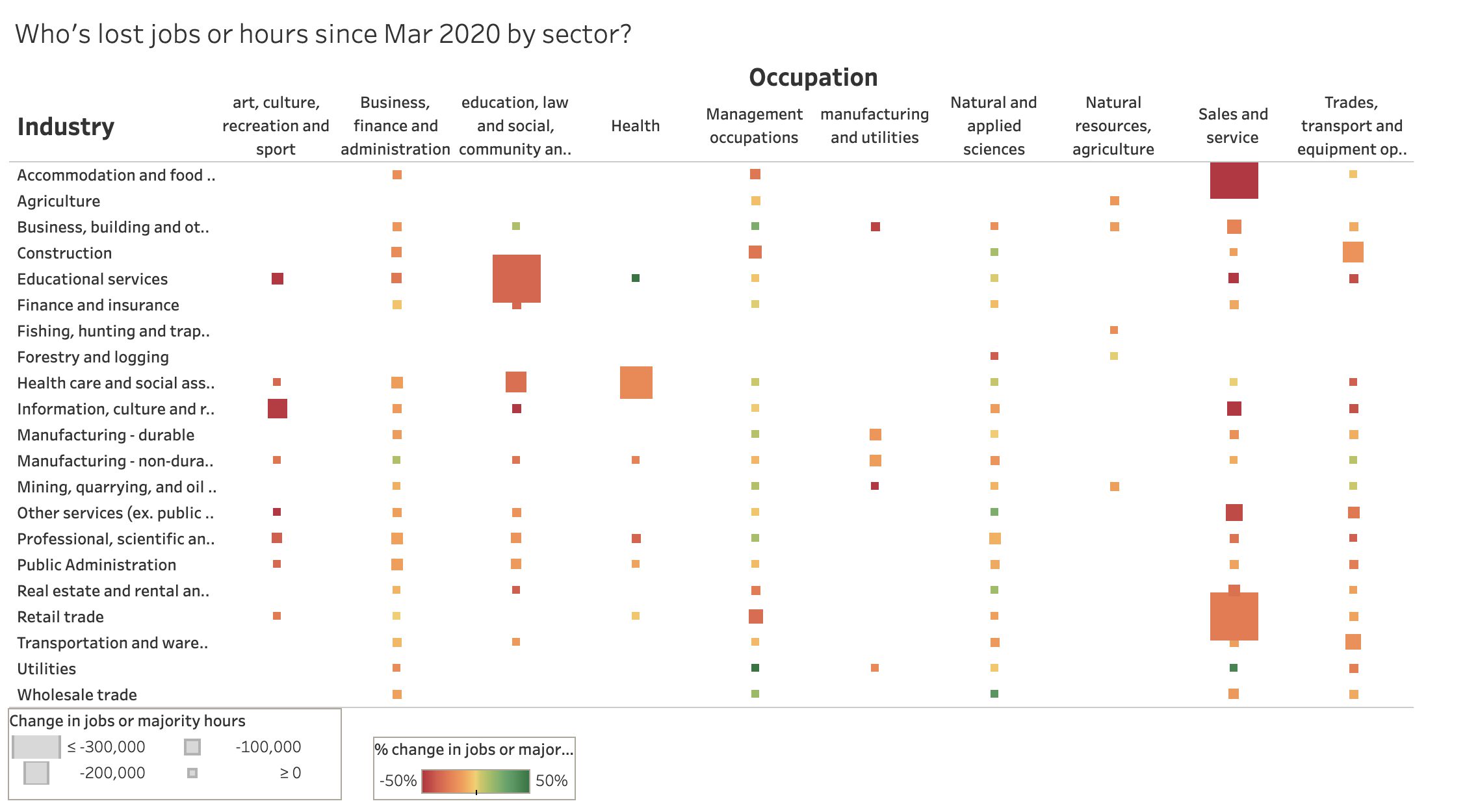
Further to my other work looking at who has lost either their job or the majority of their hours between February and March, in this blog I wanted to provide a better take on which sectors were hit hardest. For the interactive version of this graph, click through to see it on Tableau.This first interactive graph shows which occupations and industries were hit hardest by the number of jobs lost. The bigger the box, the more jobs lost and the redder the box, the larger proportion of jobs in that occupation and industry were lost. The boxes that are green saw employment and hours increase.
It’s no surprise that sales and service occupations in accommodation and food services as well as retail trade saw huge job losses and hour losses. But there were large job losses in educational services industry in occupations involving particularly social and community service. This is largely job losses among social workers, psychologists, counsellors and similar profession whose work involves close contact with clients.
What might seem surprising is the big hit in the health care industry for health workers. While health-care workers in hospitals have more work than they can handle, those in secondary areas like dentists, optometrists, physical therapists and so on have been deemed non-essential and closed.
If we place each of the boxes above on to a graph looking at hourly wage rates, we get this graph, where circle size indicates the count of lost jobs or majority of hours, the colour represents what proportion those in that industry/occupation group lost jobs or hours (green circles gained jobs and hours). The accommodation and food/sales and the retail/sales industries stand out for big job losses and low pay to begin with. The next biggest is education/social and community but hourly wages were a bit higher there.


